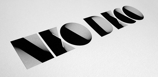
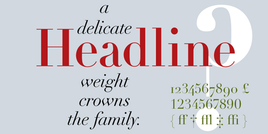
All brands need to start from somewhere and that somewhere lies with the perfect brand name, a strong logo, and good typography. Making sure all of your branding material and promotional marketing resources are clear and concise comes down to the typography used. After you’ve decided on your typefaces and structure, our screen printing and ink supplies at Steve Wood Services can develop the look of your brand.

Make it legible
You may find or design what you think to be the most creative and unique typography but will your audience feel the same way? At the end of the day your designs need to be legible. Opting for something that is too obscure of particularly fussy will cause your audience to give up. No one wants to be looking at a logo or text for five minutes trying to work out what it says! Think carefully too about the size and weight of the text. It might look much better slightly bigger, or clearer in italics or bold.
Watch out for kerning
Kerning refers to the space between each letter in a word. Although it is often overlooked, it is a minor feature of typography that can actually play a rather large part in whether your brand looks effective or not. Admittedly, kerning can take time to do and tweaking, but it will bring to the front the good designer from the bad. Avoid being lazy and have a closer look at the way the text can be read. If it is squashed or too stretched it can look distorted and messy.
Limit yourself
Having a website page or promotional publication full of different typefaces is not only distracting for the viewer but annoying too. Choosing typography that makes your logo or brand name stand out is the most important thing. The other typefaces can be kept relatively simple. You want your audience to focus in on your brand name so make sure this is clear on the page. Everything else should fit around it, not fight for space and attention!

Create a hierarchy
All brands should use at least two fonts on their website and promotional campaigns: the logo typeface and the text typeface. It is even better to experiment with a couple different fonts for your main body of text. Think about how to divide up blocks of texts by using headers which are clearly announced due to being in a different typeface. Creating a hierarchy system will make your page easier to read for your audience. Scannable text and layouts are a must in all good design, for whatever purpose.
Consider what you communicate
It is no lie that certain fonts communicate certain ideas. You wouldn’t use a swirly font for a corporate company for example, or a hand written script for an industrial company. Think about who you are and what your company is trying to convey. Once you know your audience too it can be easier to work out the right typeface. Sloppy choices will reflect badly on your company and leave your audience feeling confused as to what the company provides or values. Think of typography as your brand’s personality.
To start creating promotional material for your brand, have a look at our range of inks and stencil equipment at Steve Wood Services. Not all of our products are featured online so contact us today if you are looking for something in particular or a specific colour. Have a read through the rest of our blog for more branding and printing advice.
(All images via Creative Bloq)
