Understanding the importance of colour in marketing and branding will help your brand become the best it can be. The Pantone Matching System (PMS) has been put to use by a large number of companies in a variety of industries. These special and creative colour matching projects caught our eye though. We can provide you with the colour you need at Steve Wood Services with our range of inks.
Beer Packaging
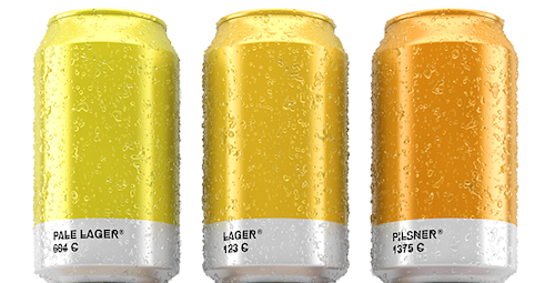
Creative agency Txaber used plain beer cans and bottles to front this Pantone colour matching project. Each part of packaging was a separate Pantone colour and correlated to a specific kind of beer, from pale lager right up to imperial stout. The simplistic designs show just how easy it is to employ colour effectively to fit a brand. The minimal packaging to mimic the Pantone cards is bold and eye catching. After all, splashing out on too many colours can be damaging for a brand or campaign.
Pixel Mosaics
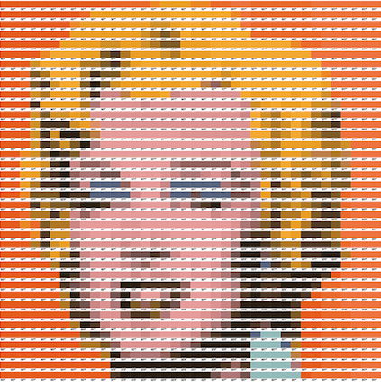
Why stick to one colour when you can use a spectrum? Although we wouldn’t normally advise using lots of colour in a single design, these colour mosaics work well precisely because of it. Another level of clever, Txaber’s use of pantone cards as pixels, create artworks. Each pixel works like a puzzle piece so that close up it isn’t very impressive, but further away you get the wider picture. From masterpieces, to logos or brands, they may be time consuming to produce but the end result looks great.
Food Dishes
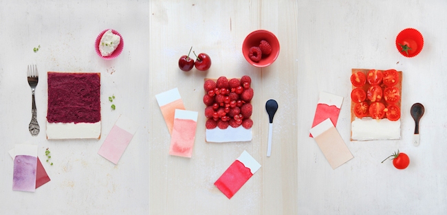
Food photography never looked so good with these culinary Pantone food matches. French website Griottes: Palette Culinaire specialises in producing a food arrangement to fit with a certain colour. The initial idea may be simple but they pay a meticulous care to attention so that all of the colours in the frame are just the right match. You’ll never look at food in the same way after seeing these! When you next visit your local supermarket or grocers you’re sure to better appreciate the variety of colour.
Street Art
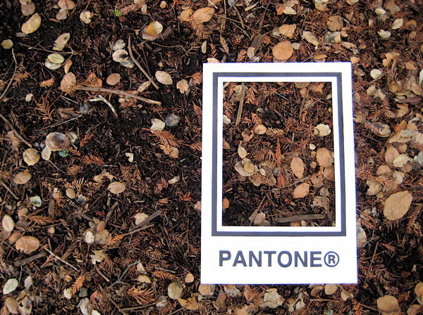
Art never looked so 3D on camera than with these street art projects by Michael Ifland. By placing a Pantone swatch-inspired frame around everyday things you would normally walk past on the street he has created a completely different take on normal street art. From brick walls and roads, to tree firs, twigs and leaves, these designs bring to life the street. Each has been given their own caption, to mimic the likes of great masterpieces.
Find out how we can match the right coloured ink for you by getting in touch with us today. Not all of our products are available to view online at Steve Wood Services, so let us know what you need and we’ll be happy to help. Have a read through the rest of our blog for more branding and printing advice.
(All images via HOW Design)