We like to think there’s no “one size fits all” approach to graphic design; that’s the beauty of the creative process – everyone’s approach is different. However, we had a quick look around at what trends various graphic designers and print artists were talking about as we began 2017. This is what we came up with…
1. Minimalism (it’s not going anywhere)
Minimalism has arguably come back into vogue, having been a popular design at the beginning of the 20th century. The flat designs and simple aesthetics which characterise minimalism have been proving a welcome remedy to the noisy, loud and cluttered designs on the market. Minimalism designs are a symbol of precision and purpose, and their popularity in 2017 shows no sign of abating; minimalist design remains cutting edge, it’s simplicity synonymous with elegance and refinement.
2. Hand-drawn images
In a world of “fake news ” and “alt-facts” it’s no wonder that people are looking for messaging and branding to look as genuine and authentic as possible. This may be one reason behind the sudden popularity of an image style which some may be tempted to dismiss as “childish” or somehow facile – we prefer the term “playful”. There’s also a fine art to hand-drawn images; it takes a special kind of skill to make a design seem uncomplicated.
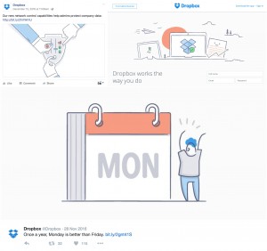
Such is the utility of hand-drawn images, you’ve probably come across them and not even realised it. Take a look at the Dropbox iconography, which uses hand-drawn images in its style.
3. Form simplification
Form simplification has taken hold in the graphic designs of a few popular logos. So form simplification isn’t a trend favoured by new, disruptive upstart brands, so much as it is a marketing tool used by big-names. For example, the Mastercard logo has undergone a simplification after years of the same trusty design adorning all our credit and debit cards. The Mastercard logo rebrand has been used by a few other graphic design commentators to highlight the effectiveness of form simplification and it’s not hard to see why; the basic use of colour has stayed the same, and our brains are still used to the same familiar colours. However the form simplification has led to a design which is considerably less cluttered. ![]()
![]()
There is an element of minimalism (see above) in the form simplification movement. However, this not all down to artistic temperament: form simplification is common sense in a world where we are increasingly using hand-held devices.
4. Duotone
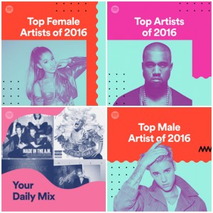
Duotone design seems to be more of a web design phenomenon at the moment; however this doesn’t mean it doesn’t have the capacity to spread out into the other arenas of design also. Duotone has proven to be a popular trend with companies such as Spotify, who are not afraid to use a simple assemblage of bold colours in their designs. Some companies are even cheating somewhat; rather than limiting themselves to two colours, they are using a Duotone effect for simplicity, but subtly using a small group of colour palettes – Instagram are a good example of this.
5. Vintage
Vintage may seem like such a familiar design trend it’s almost a cliche in and of itself. But all the design commentators agree that we’re not quite ready to say goodbye to vintage as a concept. The guys over at In Design Skills think that this year’s vintage colour schemes and design motifs will take their cue from a certain other trend – mindfulness.
So how will this translate in design terms? Letterpresses and screen printing will form part of a brighter vintage colour palette, hopefully creating a fusion of old and new.
The challenge will come in ensuring that vintage logos don’t come to be totally synonymous with something old.
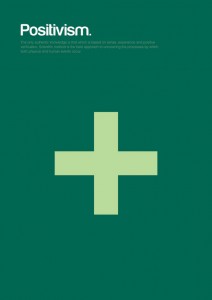
6. Geometric shapes
As with many of the themes in this list, there is nothing particularly new or novel about the geometric shape as a design pattern, it nonetheless remains the case that unconventional polygons have received a renewed interest from graphic designers.
7. Negative space
Negative space was cited as one of the trends to look out for in 2016, and it looks as though it is going to remain a trend for 2017 as well. Negative space relies on a style which ensures there is more to your logo than meets the eye. Positive and negative space compete for the audience’s attention, meaning that any print or design which uses this style requires a certain amount of visual finesse.